
OVERVIEW:
Zooshoo.com is a fashion retailer launched in 2012. The company rose in popularity with young adults, but growth stalled as the company struggled to manage their growing inventory and handle customer issues. My role was to identify key areas where customers struggled and where improvements to their e-commerce experience can be made.
ROLES & RESPONSIBILITIES
User Research
Testing
Wireframing
SCOPE & CONSTRAINTS
As the sole designer, I worked with two developers for this project. We were limited based on what was achievable in on the Shopify platform.
PROCESS:
Based on what customers were saying about us on social media, inquiries, and review sites, I compiled key components that needed to be addressed. Then, I conducted interviews with customers and also new users, and identified key areas where there was difficulty. Some key insights we considered:
FAQ often did not provide clear answers
It was difficult to find contact information for help
Customers often abandoned at checkout because they could not find where to input coupon code
Cart abandon rate was high because trust of the company was low
Users couldn’t find what they were looking for
Mobile site was difficult to maneuver and the checkout process had glitches
Through competitor analysis, I determined we were missing key features that our user found helpful in the interviews. We tested our design with users using paper prototypes, and later on, a/b tested simple design changes using Optimizely to refine copywriting and color choices.
DESIGN SOLUTIONS:

Checkout page features:
Second Checkout button was placed at the top of the page. This made it easy to quickly checkout without scrolling. Tested to gain higher checkout rates.
The sale price was displayed with the full price crossed out to bring attention to discounts.
A PayPal checkout button was added so that customers can checkout with ease and trust from a protected platform. Previously, PayPal was only accessible on the payment page.
Promotional Code box was included so that customers can quickly calculate the discounted price and move to checkout. Previously, the code could only be inputted at payment, leading to abandonment early on. I chose to grey this box out and make it accessible upon clicking so that customers who did not already have a code wouldn't be prompted to google for one.
Credit card icons were added at the bottom of the page to further promote trust in our company and service.
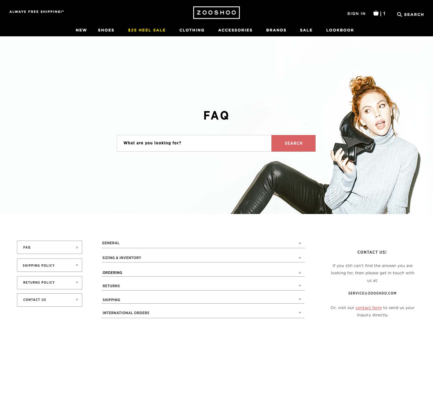

FAQ page features:
Customer service topics are broken down by categories to make it easily readable. It minimizes text so that customers won't be bogged down reading irrelevant information.
Search function makes it handy to quickly attain the information needed.
Company contact information is static on the right side of the screen for accessibility
Contact form was created with focus on helping customers target their issue, and for our customer service team to quickly understand the problem.
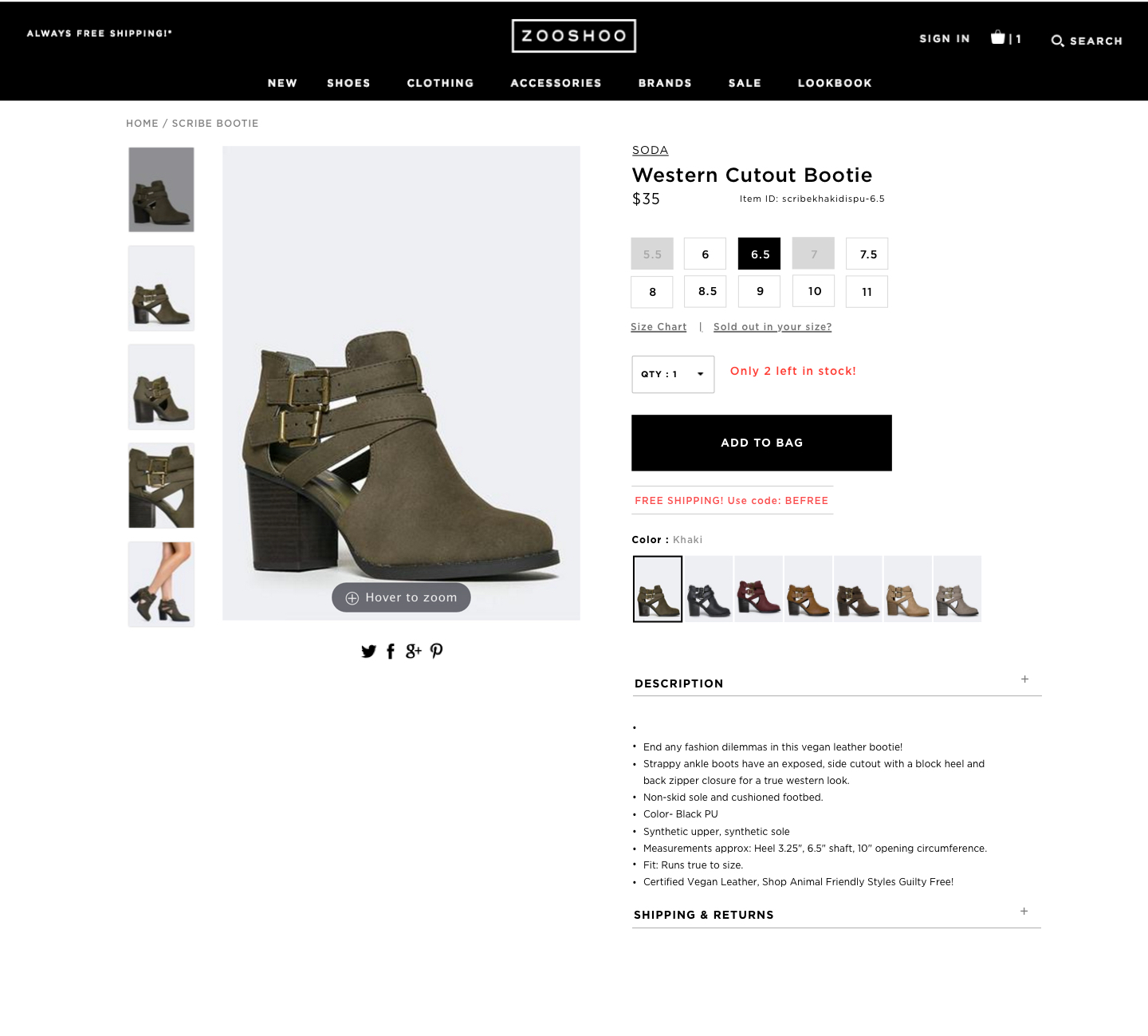
Product Page features:
Two solutions were designed for this page and are outlined below. The first solution (left) was designed with the current layout in mind and only adjusted for small changes.
Solution one:
Made available and out of stock shoe sizing clearer
Added a Quantity drop down menu because often times customers bought affordable shoes in bulk.
Free Shipping code and existing sale codes added below product
Product color variations: I changed the interaction of this so that when clicking on other colors, only the main product image changed. Before, clicking on a different color reloaded the entire page, wasting time.
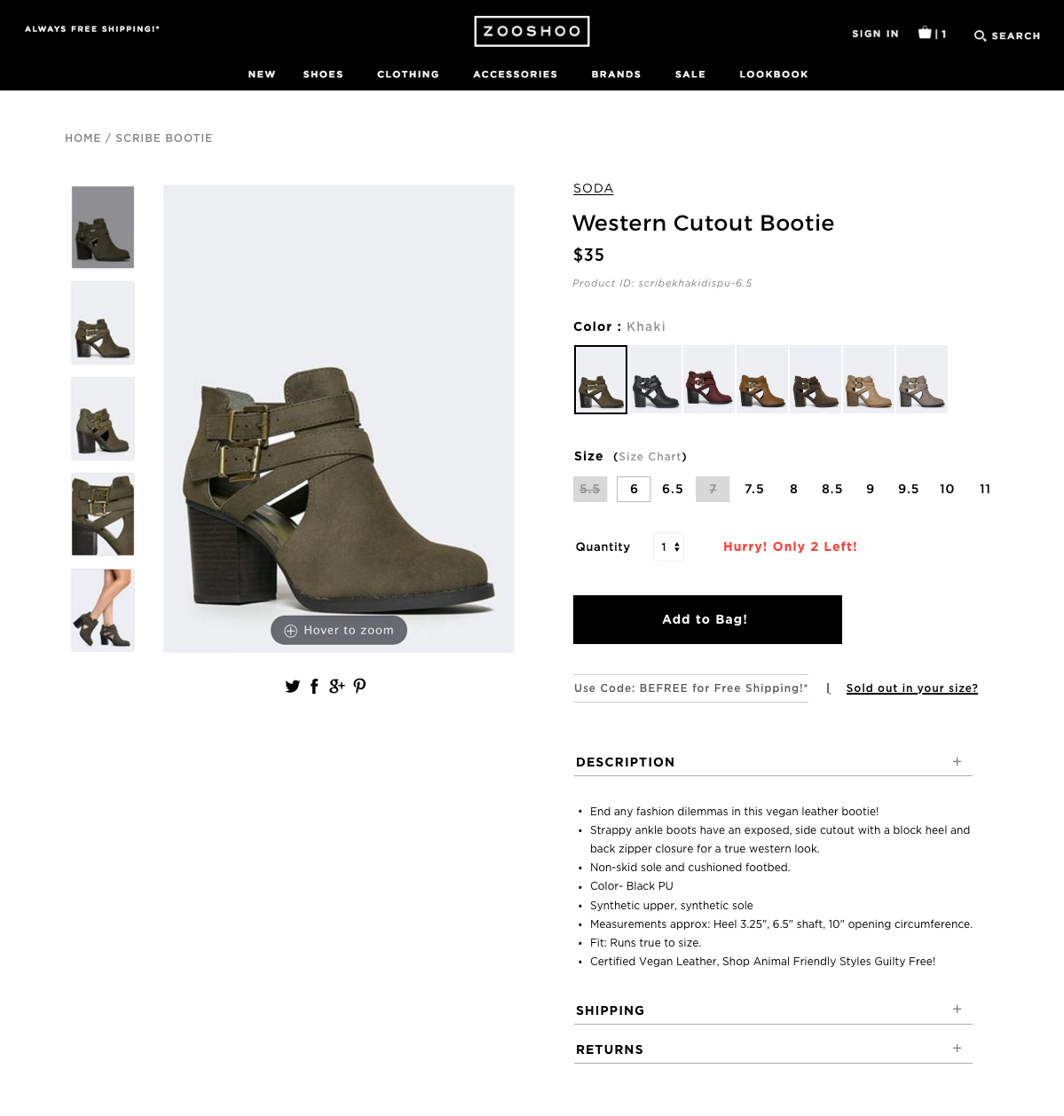
Solution Two
This second solution was a new formatting style to test, placing emphasis on the accessibility of color variations.
Moved shoe color variation to the top so that customers can immediately see them. This was based on customer shopping behavior. The first thought of users was often “Are there other colors?”
Product color variations: I changed the interaction of this so that when clicking on other colors, only the main product image changed. Before, clicking on a different color reloaded the entire page, wasting time.
Added a Quantity drop down menu because often times customers bought affordable shoes in bulk.
Free Shipping code and existing sale codes added below product
Size buttons were opted for instead of a dropdown menu that way customers can immediately see whether their size is in stock.

Mobile Improvements
The main issue with our mobile site was difficulty navigating and editing products during checkout. This led to abandoned carts once the process became too tedious. The rate of checkout on desktop was still much higher than on mobile. This showed us there was an opportunity space with mobile checkout.
The solution was to create a checkout button that was static at the top of the screen and responsive to the page so that customers can check out without having to scroll.
Once in the shopping cart, I wanted to make it easy to edit and change their selections. I added the ‘Edit’ options that way customers can change sizing and color directly within the cart, rather than navigating back to the product collection.

Mobile Homepage
A main problem uncovered was that customers could not easily see the product categories they were looking for, since navigation was hidden within a hamburger menu. Additionally, we found that a selling point of our site was our weekly new arrivals, but customers could not see the newest products unless they clicked into the collection and searched for it.
Using data, we determined the most popular categories that customers were looking for, and put them in the main header for easy access.
Product listings were added below the main homepage so that new arrivals could be directly added to cart.
In addition to the existing hamburger menu, customers can access the main categories on the homepage when scrolling down.
NEXT STEPS:
The next steps will be to continuously test and iterate on these changes, making sure to track progress on different features.